
WKO5 Rider Performance Reports
How do you know the training you're doing is actually working?
Most riders don't.
A bespoke WKO5 power analysis that reveals exactly what's holding you back — and the precise actions to fix it. Built by a cycling coach with WorldTour experience.
7-day delivery · Fully bespoke · Based on your actual power data
Sound familiar?
You're training.
But is your training
actually working?
Most amateur cyclists are getting fitter at surviving their sessions. Very few are getting faster at racing. The difference lives in your data.
-
The hours are the same. The effort feels the same. But the numbers won't move. Adding more training to a broken model just accelerates the plateau. The problem isn't volume — it's that you haven't identified which lever to pull.
-
Description text gThe climb hits. The bunch goes hard. And you're out the back before you've processed it. It isn't a fitness problem. It's a specific physiological limiter — and your data already knows exactly what it is.oes here
-
Description teDeep down, you're not sure the plan is right. If someone asked you why Tuesday's session makes you faster at your target event — could you answer? This report means you'll never have to guess again.xt goes here
Any guesswork has been removed. Completely. I now know exactly what to focus on and how to get the best out of myself. I'm already better than I was.
Adam Swan · Amateur road cyclist
Data you've never seen
about yourself
INSIDE THE REPORT
These aren't TrainingPeaks screenshots. This is WKO5 — the same software used by WorldTour coaching teams. Most riders have never seen any of these charts about their own data.
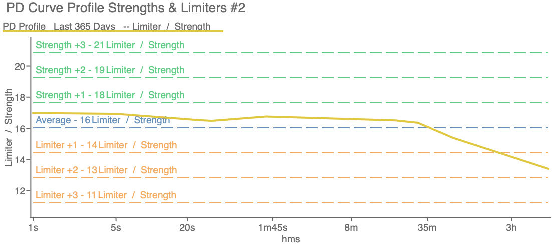
Strengths & Limiters Map
The zones where you outperform your own average — and the exact zone that's costing you races. This is where the training prescription starts.
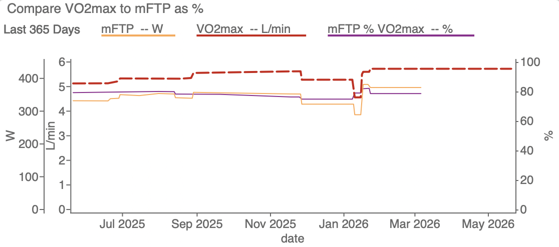
VO2max vs Threshold Efficiency
What percentage of your aerobic ceiling converts into threshold power? This tells you whether more VO2max work — or more threshold work — is the right call.
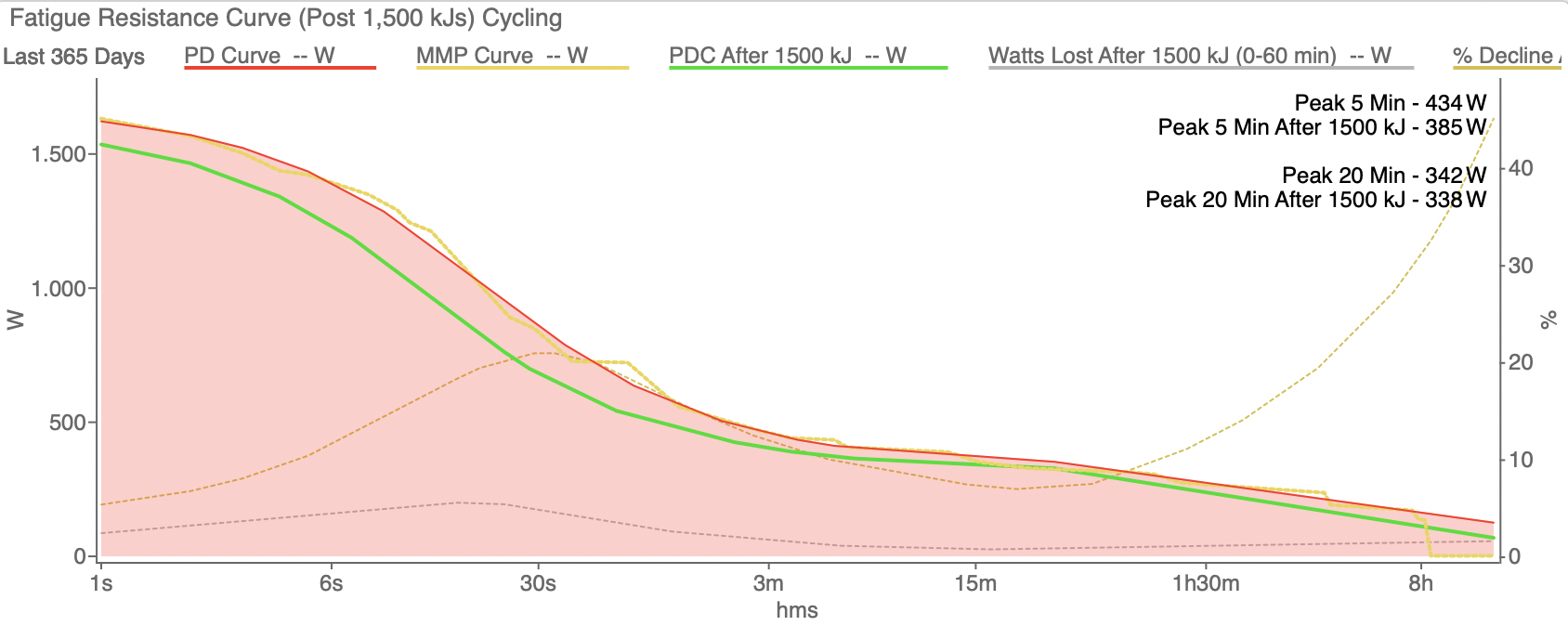
Fatigue Resistance Curve
How much power do you lose after 1,500 kJ of prior work? This metric explains why riders fade late in races. Almost nobody measures it.
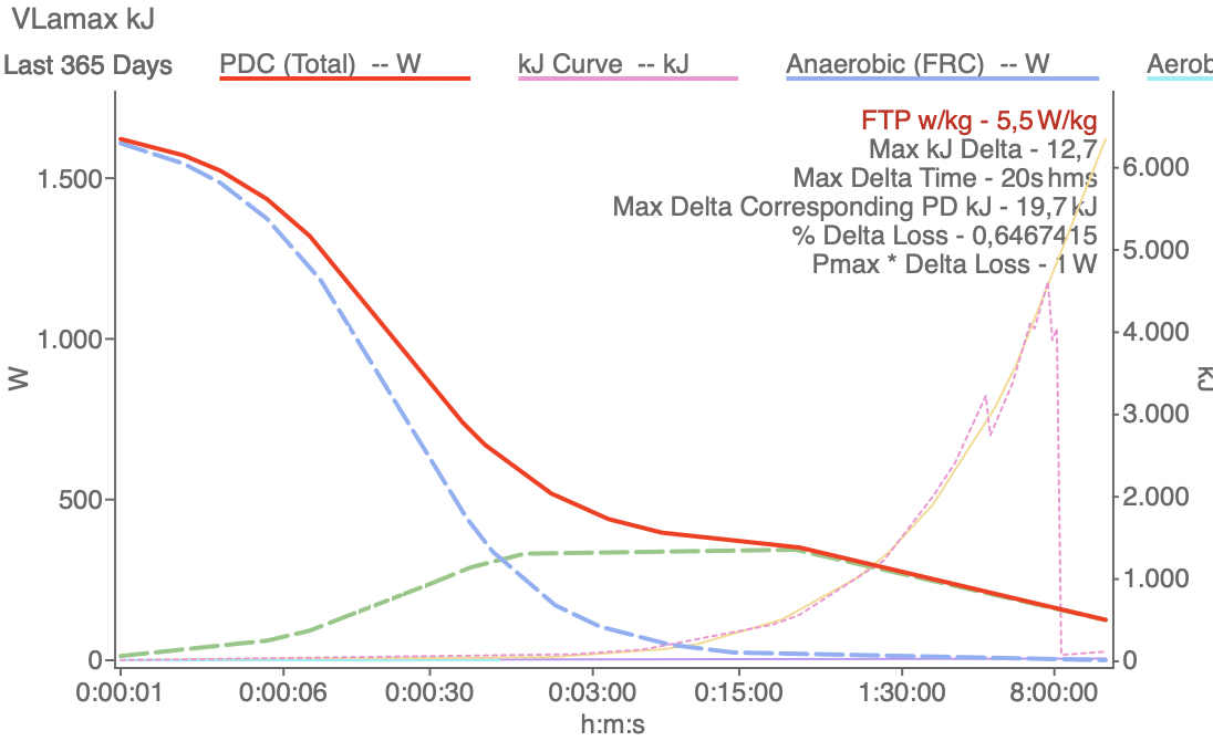
Glycolytic Capacity & VLamax
The rate your body produces lactate — too high and it limits your FTP ceiling, too low and you can't attack. Most riders have never seen this about themselves.
Two options. One decision.
PRICING
Both include the full bespoke WKO5 analysis. The bundle adds a 60-minute video call where we turn the data into an actual training plan together.
£229
✓Full bespoke WKO5 analysis
✓Power Duration Profile & benchmarks
✓Strengths & limiters map
✓Fatigue resistance & durability
✓Energy system & VLamax analysis
✓Individualised training zones
✓Race-specific recommendations
✓Delivered within 7 working days
REPORT ONLY
£299
✓Everything in Report Only
✓60-min 1-on-1 video call
✓Walk through every chart live
✓Turn the data into an actual training plan
✓Every question answered
✓Scheduled after report delivery
REPORT + CONSULTATION
Payment via Revolut · One-time payment · Work begins after payment confirmed · Full T&Cs apply
QUESTIONS
-
Most riders spend more than £229 on kit that makes zero measurable difference to their speed. This report tells you exactly what will. It's a bespoke physiological analysis written specifically about you, using the same software as WorldTour coaching teams — not a template.
-
TrainingPeaks shows you your data. This report tells you what it means. WKO5 goes far deeper — true mFTP, FRC, durability, VLamax, energy system analysis TrainingPeaks shows you your data. This report tells you what it means. WKO5 goes far deeper — true mFTP, FRC, durability, VLamax, energy system analysis — none of which are in TrainingPeaks. The interpretation is what turns data into direction. none of which are in TrainingPeaks. The interpretation is what turns data into direction.
-
You don't need to be fast. You need to want to be faster. The report is most valuable for riders who train consistently but aren't getting the results their effort deserves. The analysis works regardless of your absolute numbers — it's built around your physiology and your goals.
Still not sure?
Stop guessing.
Start knowing.
Find out exactly what your data says about your physiology — and precisely what to do about it.
7-day delivery · Bespoke WKO5 analysis · WorldTour coaching experience